Our Android App wins Editor’s Choice in the Google Play Store
We’re incredibly proud to share this tremendous feat on behalf of the fashion e-commerce industry.
Our mobile team has recently learned of some exciting news: Our Zalando Fashion Store App for Android has been awarded the prestigious Editor’s Choice badge in the Google Play Store – a feat that we’re incredibly proud to share on behalf of the fashion e-commerce industry. The Zalando Fashion Store app is the only fashion e-commerce app at the moment in the Editor’s Choice listing, which includes the Top 150 apps across the globe from various digital industries. The Editor’s Choice badge and listing appears on the Google Play Store for all countries the app is available in.
The award is carefully curated by the Google Play Store team, selecting apps that follow Android best practices. Not only that – the app that receives this badge must have best-in-class customer experience as well as very high Android app quality ratings. The ratings are derived from various app metrics that indicate user satisfaction, engagement, as well as technical quality.
The Zalando Fashion Store app, continuously and from the beginning of its launch, performed very well in all the above mentioned metrics. For example, we maintained the app ratings we received from our users to a minimum 4.3 out of 5.0 at any given time since app launch, which puts it above the industry benchmark and says a lot about user experience and app quality. These aspects made our Android app eligible for the Editor’s Choice feedback process, where we started adapting to Android best practices to receive the badge. How did we do it? Let’s look at some of the highlights:
Have material design
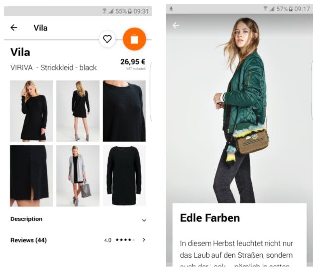
Google launched their material design language and related concepts in 2014 to make greater use of grid-based layouts, animations and transitions, as well as depth effects. Material design made it possible for apps to not only enhance the design of, but also improve the user experience. We adapted material design aspects in various forms such as depth effects, touch feedback, floating action buttons (FAB), and meaningful transitions. We experimented by A/B testing certain aspects to see if they provided a better experience for our users. Navigation elements combined with meaningful transitions and animations helped us guide our users to the most important areas in our app. We also used bigger and better imagery to deliver a superior fashion experience in the app.

Implement latest Android features
To enhance the seamless and cross-platform shopping experience for our users, we implemented the latest Android features such as Smart Lock, Android Wear, and enhanced the experience on tablets. Smart Lock allows our users to share login credentials on their Android smartphone, tablet, and on the web, on top of being highly secure. These features gave us an added advantage in reducing friction between platforms and enhancing the customer experience across all of our platforms.

Make it trendy
We are becoming Europe’s biggest online fashion platform and it’s very important that we convey the latest trends in attractive ways to our customers. We used the idea of striking imagery from material design guidelines and took it even further to make our images highly relevant, informative, and delightful. We redesigned our home screen experience with these images to deliver the latest fashion trends in different formats such as images, videos, lookbooks, and carousels. Aside from the home screen, we made sure that our users would see fashion articles in a way that suggests the look, the fit, and any relevant outfit that could go with the article itself.

Get the UX right
Getting the UX right was another important aspect, especially as we have diverse user groups to serve. We made sure that we had the most relevant navigational elements for discovery, shopping, and convenience put on the home screen. It was also crucial to manage deep navigational hierarchies, for e.g. with article recommendations, when rethinking the app navigation concept. Access to the most important actions and making them easy to find for indecisive users were key elements we covered. Feedback messages for user actions helped us achieve an improved user experience and better conversion. During the whole process we paid attention to various details of the app and to guiding users through a smooth and joyful fashion experience.

There were, of course, many other small changes we made to make sure we delivered a superior app experience by following Android best practices. The app reviews carried out by the Google Play Store team provided us with great feedback for improvements. It was also important and incredibly helpful to maintain a healthy partner relationship with Google for continuous follow-up and feedback.
I would like to congratulate and thank the Android app, design, and product teams who made it all possible and achieved this great feat. I would also like to thank the Google Play Store team and our Partner Manager from Google, Maxim Mai, for their continuous support and feedback during the whole process.
At Zalando, we always put ourselves in our customer’s shoes to improve our products, incorporating as well as innovating our best practices to produce the ultimate customer experience. It’s encouraging to receive such a prestigious award. This is just the beginning for our Android offering!
We're hiring! Do you like working in an ever evolving organization such as Zalando? Consider joining our teams as a Mobile Engineer!


